
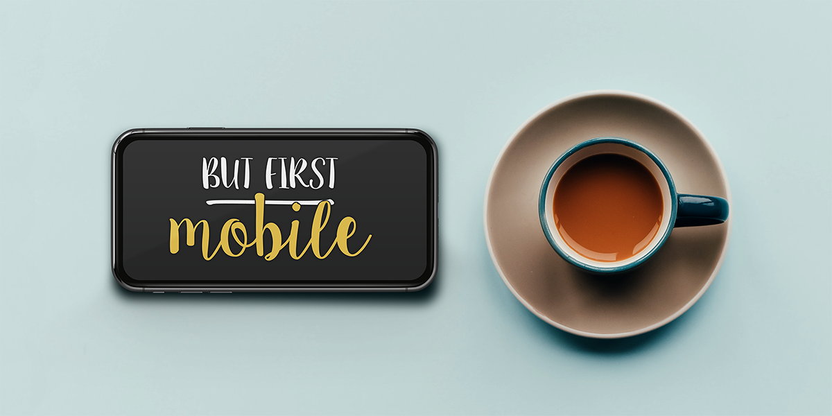
Contrary to the meme, coffee doesn’t come first in web design.
Mobile comes first, coffee comes in close second, and desktop comes third.
Mobile design takes precedence for pretty obvious reasons: we’re all using phones more and computers less. As of March 2018, it's about a 50/50 split—with phones and tablets accounting for roughly half the total web traffic in North America. But mobile will soon take the lead.
And in some cases, it already has. In our truck driver recruiting work, more than 75% of our web traffic comes from phones. That’s no surprise. Drivers are on the move, so they rely on mobile devices.
But even if truckers aren’t your target audience, it’s time to adopt a mobile-first mindset because that’s where everyone’s headed—including Google, which has been prioritizing mobile sites since 2015. So if you want to rank higher in search results, your site needs to work great on a phone.
To put mobile first, do it first.

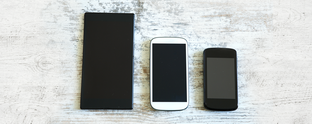
Start there. Actually make your mobile site first. Begin at the smallest size and work your way up. That’s the reverse of the traditional approach of designing for full-size monitors first and then resizing, replacing, or removing things for smaller displays.
Mobile-first design works better because it puts first things first.
It forces you to prioritize. You don’t have the screen space to show everything at once, so you have to rank your content and present it in that order. That makes your entire site better at any size.
Mobile-first also keeps your visitors first.

Since the majority will view your site on their phones, you’re seeing it from their perspective. And you’re interacting with it the way they will, so you’ll make sure text is readable, pictures are viewable, and buttons are usable.
Those are the main reasons we put mobile first, and if you need some help doing the same, get out your phone and give us a call.