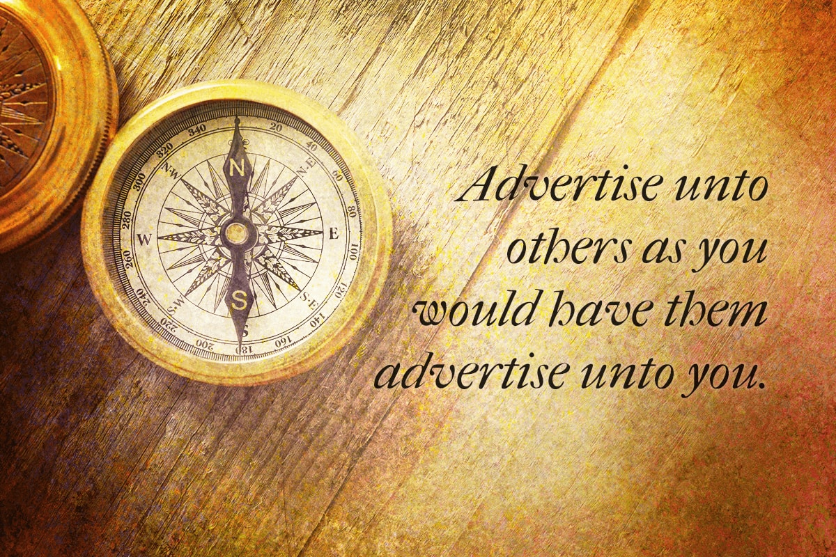
That’s the golden rule of advertising.
It's the single promotional principle that should take priority over the rest. Giving our audience the same honesty, respect, and value we want is the north star that should guide every campaign. It’s the virtuous course every adman should chart.
But there’s a south end to the compass as well—a way of vice that could rightly be called the pirate’s rule of advertising. Minus the swearing and incomprehensible slang, it goes something like this:
It’s a treacherous course teaming with trickery, thievery, indecency, and worst of all, modal ads—those blasted full screen pop-ups that commandeer your web page.
But yo ho ho, maties, a pirate’s life is not for we...or us. Not just because it’s bad, but because it’s bankrupt. It leads to loss, not loot. The tried and true way to profit is to show the real value and usefulness of something. That sets a straightaway course for voluntary, mutually beneficial, and ongoing transactions.
Pirate tactics shipwreck that process. They rob customers of real insights, decision making, and buy-in. And in turn, they rob companies of trust, reputation, and future opportunity. It’s a mutually bad trade that’s about as smart as exchanging gold for lead.
Here then, are three commandments to steer a true course and keep from sinking down to Davey Jones’ Locker.
First, Ye Shan’t Mislead.
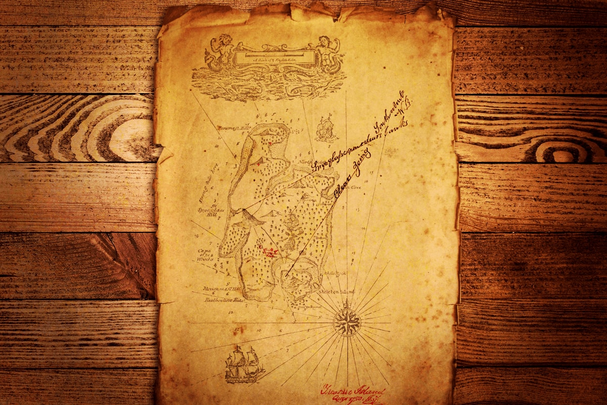
Make X mark the spot in your ads—meaning, point people straight to the goods and avoid bait and switch techniques. This should go without saying. Unfortunately, misdirection remains all too common in advertising. Here are three tactics, in particular, to avast.
Limited Stock
Instead of finding treasure at the X, you find an RSA (raider sales associate) who regrets to inform you that the gold has just run out. But wait! They still have something just as valuable: ship’s biscuits. Protect yourself from the next big economic crisis by having a ready supply of permanently shelf-stable food. (And of course, it really will last forever because the stuff’s inedible.)
Fine Print
The map’s large, easy-to-follow instructions led you straight to the mother lode—the legendary treasure of the Isla de Muerta. But after taking it, you begin to feel ghastly side effects and consult the map’s fine print:
WARNING! Isla de Muerta contains cursed Aztec blood money known to cause the following side effects: loss of appetite, dry mouth, skin and tooth decay, loss of bodily sensation, and prolonged living death. Restoration and return policy available. See Pirates of the Caribbean for details.
Actual Item Not Pictured or to Scale
You get into port before dawn and join the ranks of red-eyed marauders waiting for this year's Black Friday steals. The frosty salt air stings, but you hardly feel it as you imagine yourself basking in the glow of the ultra HD treasure chest advertised on your handbill. Towering above a ship's main deck, it looks as big as a sail (or whale), and today only, the price is reduced by 95%.
Unhappily, so is the size. That's what you discover hours later when the doors open. The titanic treasure turns out to be a tiny trinket box resting on a model ship. Only then do you notice the handbill's disclaimer, “Not actual size.”
These are the worst...
...but not the only ways to mislead. Instead of trying to list and forbid every possible bait and switch technique, let’s just follow this principle: reject any tactic that promises (or hints at) one thing and delivers another. That brings us to the next command.
Second, Ye Shan’t Bury the Lead.

People have to mine for lead, but they should never have to dig for our lead message. We should put it right on the surface—at eye (or eye patch) level. In particular, let’s avoid making these two mistakes that cover up what matters.
Making the Message Unclear
Sometimes, an ad lacks clarity because it lacks quality. It’s just poorly composed, like the creative team was either a bunch of cabin boys or was three sheets to the wind. If that’s a persistent problem for your advertising, the answer is simple: throw the floundering team overboard and replace them with a seaworthy crew.
Often, however, the problem isn’t quality, but cleverness. In an attempt to be witty, a writer will sometimes sacrifice clarity. Take this pirate banner ad as an example.
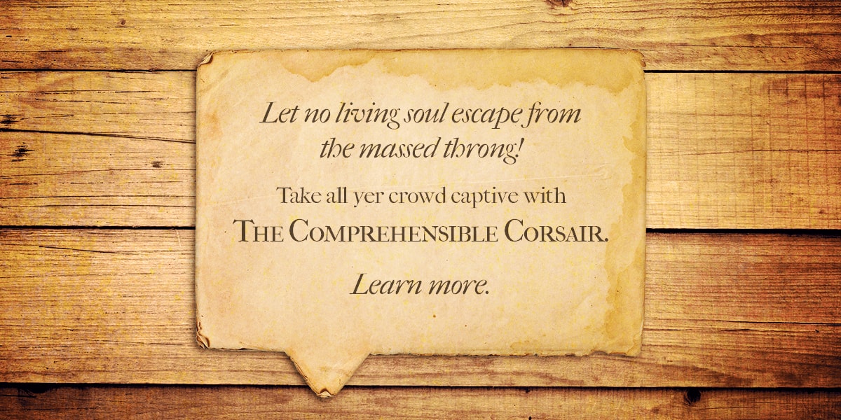
This ad is for a pirate communication course called the Comprehensible Corsair, but that message is murky at best from the current wording. Only when we know what it's for we can see the wit—the analogy between capturing prisoners and capturing an audience. But without that foreknowledge, the ad seems to offer some sort of pirate trap or decoy.
Here’s a clearly written alternative.
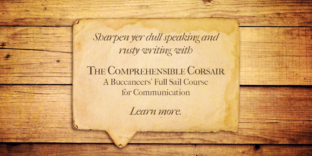
So much for the murkiness. That message is crystal clear and easy to swallow. All it’s lacking is some extra seasoning, and that’s often the case when you focus on being understood, rather than being clever. A message that’s clear as water runs the risk of being, well, watered down. So how do we make our message easily digestible yet full of flavor?
Simple: by writing for clarity first, then infusing some cleverness second. In this case, we can take some ideas from both of the previous versions and mix them together.
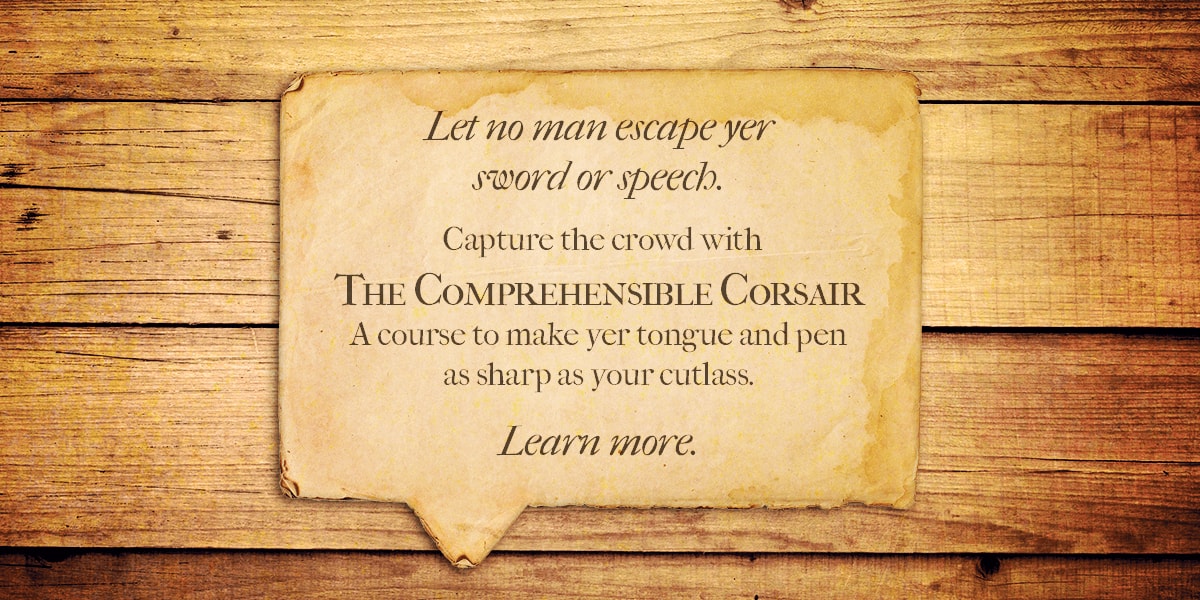
Having achieved clarity, quality, and even some measure of cleverness, let's move on to the second mistake that covers up what matters.
Making the Audience Unearth the Offer
On break from deck swabbing, young Barefoot Billy cruises Facebook and spies an ad. "Blimey!" he exclaims. "Those be the very buckle boots I've had me good eye on for a full fortnight! And they be half-price!" Eager to seize such...(wait for it)...booty, he clicks the ad.
But ho, what’s this?! The ad carries him NOT to the product page, NOT even to the men’s boots page, but instead to the home page of the retailer, Boots, Brogues, and Boat Shoes (or “Thrice B” as pirates call it). Having lost his bearings, Billy spends the rest of his break searching the site in vain for his lost booty until the boatswain orders his worthless, unshod hide back to work.
Back he goes, but not before vowing in his heart that when he’s grown with a ship of his own, he’ll sink every Thrice B vessel on the high seas. The end.
The tale is fictional. The lesson is true. We’ll lose sales or customers (and perhaps even gain foes) if we don’t direct each ad to the appropriate, corresponding landing page. In Billy’s case, the buckle boots ad should have taken him straight to the specific product page.
On the other hand (or foot), if the ad had promoted a general storewide boot sale, it should have gone to a page specifically for that sales event, or at the very least, to pre-filtered search results that only included the boots on sale.
What Thrice B (and we) should never do is link an ad to our company home page and expect people to dig for what they’re after. It’s our job to do the work and give them an open, unobstructed path to our offer.
There's another way we should avoid covering what we're advertising, and it's our final commandment.
Third, Ye Shan't Gild Lead.

In other words, don’t embellish what you’re promoting. Contrary to popular belief, that's not the goal of advertising, or at least, it shouldn't be. If we're selling lead, then our ads shouldn't sucker people into believing it's gold. Rather, they should show how it can become gold—either by saving money or adding value.
That's easy if we're selling to pirates. They can turn lead into musket balls to capture gold...but on second thought, maybe that’s not the best example. It kind of runs counter to the whole current of this article, so here's a better choice: Walmart.
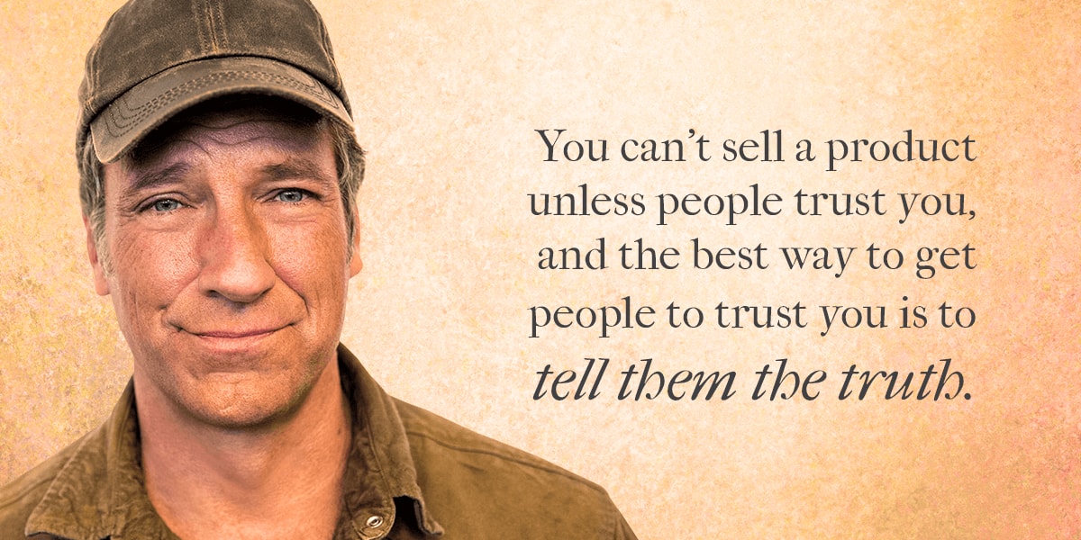
They, too, deal in lead, at least figuratively. Walmart products are cheap and abundant, but they don't attempt to exaggerate their worth. Rather they emphasize that the bargains help us save money and live better. That's a solid example of truth in advertising—and for good measure here's another from Mike Rowe about a remarkably (and humorously) honest girl scout selling cookies.
Mike provides the perfect conclusion not only to his video, but to this article when he says:
May all our advertising follow that golden course and eschew the plunderous path of pirates.
Just one more thing: if you need a trustworty partner to help chart your course, well then, let's talk.
