
In the last article, we discussed the purpose of landing pages, and at the end, promised to provide a preflight checklist—a rundown of the features that landing pages need to be flightworthy.
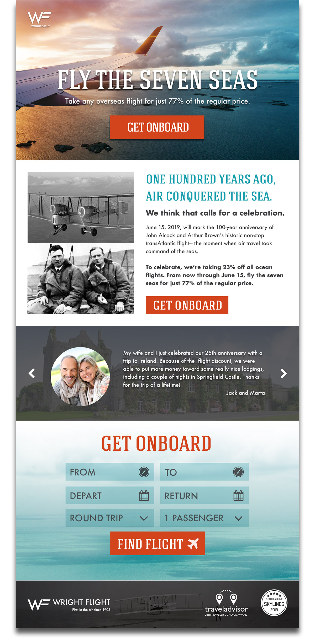
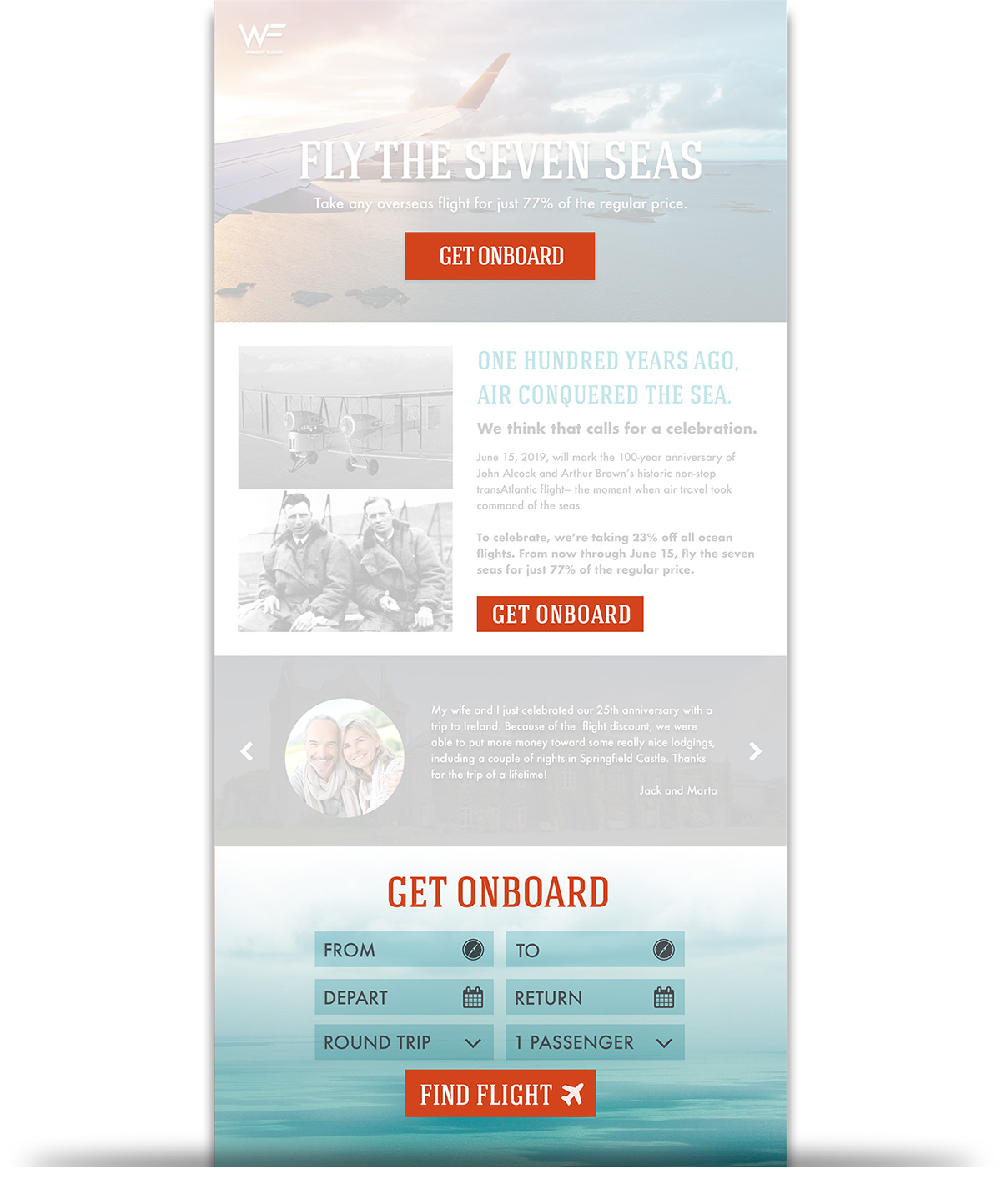
Since we’ve got this aviation theme going and because it’s better to show rather than simply describe these features, we’ve mocked up a landing page example. Here’s a snapshot of the whole thing, but we’ll inspect the individual parts as we move through the checklist.
Precision Engineering
Want your page to get off the ground? Want people to get onboard? Then professional quality design is a must. Whether you’re working with an internal web team, with external partners like us, or even with a do-it-yourself site like Wix, make sure your design is airtight.
- Fully Responsive — Make sure it looks great on any device.
- Highly Polished — Use professional video, photography, and graphics.
- Carefully Inspected — Take time to get your message (and grammar) right.
Direct Connections
As our previous article explained, people will reach your landing page through an advertisement. Regardless of that ad’s location—Google, Instagram, email, or wherever—it should directly connect to your page.
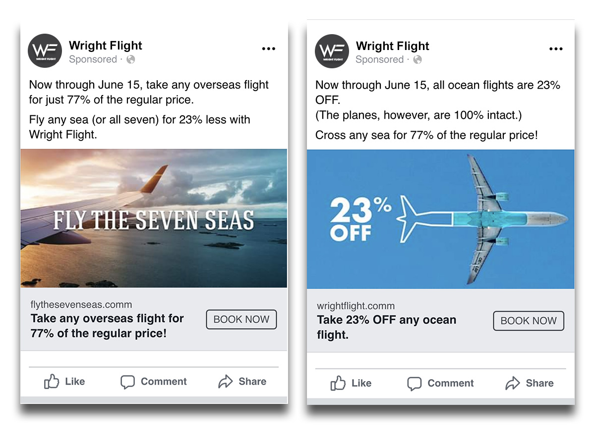
Of course, that includes a direct link—someone clicks the ad and goes straight to the page. But what’s more important is a connected message between your ads and landing pages. Check out this side-by-side of an ad that matches our page and another that doesn't.
Even though the mismatched ad is well-designed, it departs from the campaign look and feel, so page visitors might be a bit confused upon arrival. To prevent that, keep your pages and ads directly connected.
Static-Free Communication
Don’t clutter the airwaves. When writing your message, start with what’s most important, then finish as quickly as you can.
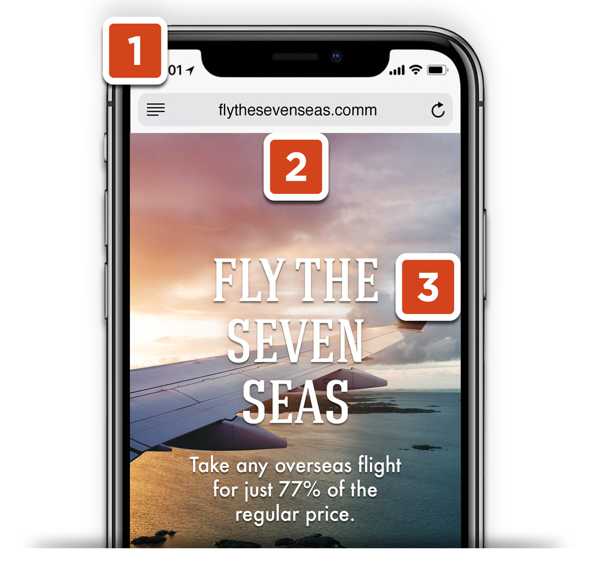
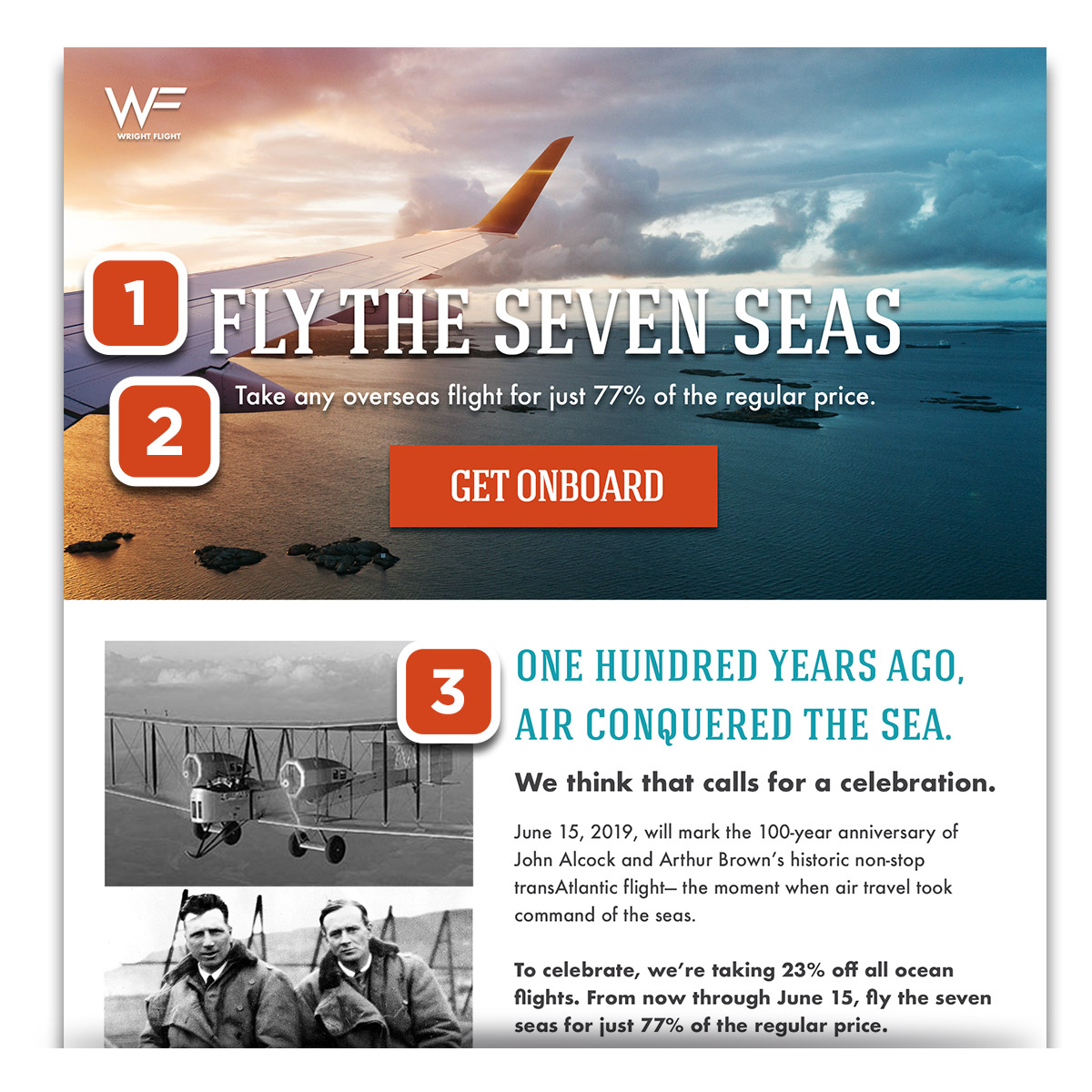
- Lead with a strong, catchy headline.
- Clarify it with a short subheader.
- Spell out the details sufficiently, but concisely in the body of the page.
Remove any other messaging or elements that don’t support what your page is promoting. Just look at what’s NOT on this one. No navigation menu. No “About Us.” No links to Facebook or Twitter. In other words, this isn’t a website. It’s a stand-alone page dedicated to the Fly the Seven Seas sale. That tight focus is what makes sure your message gets through static-free.
Commuter Confidence
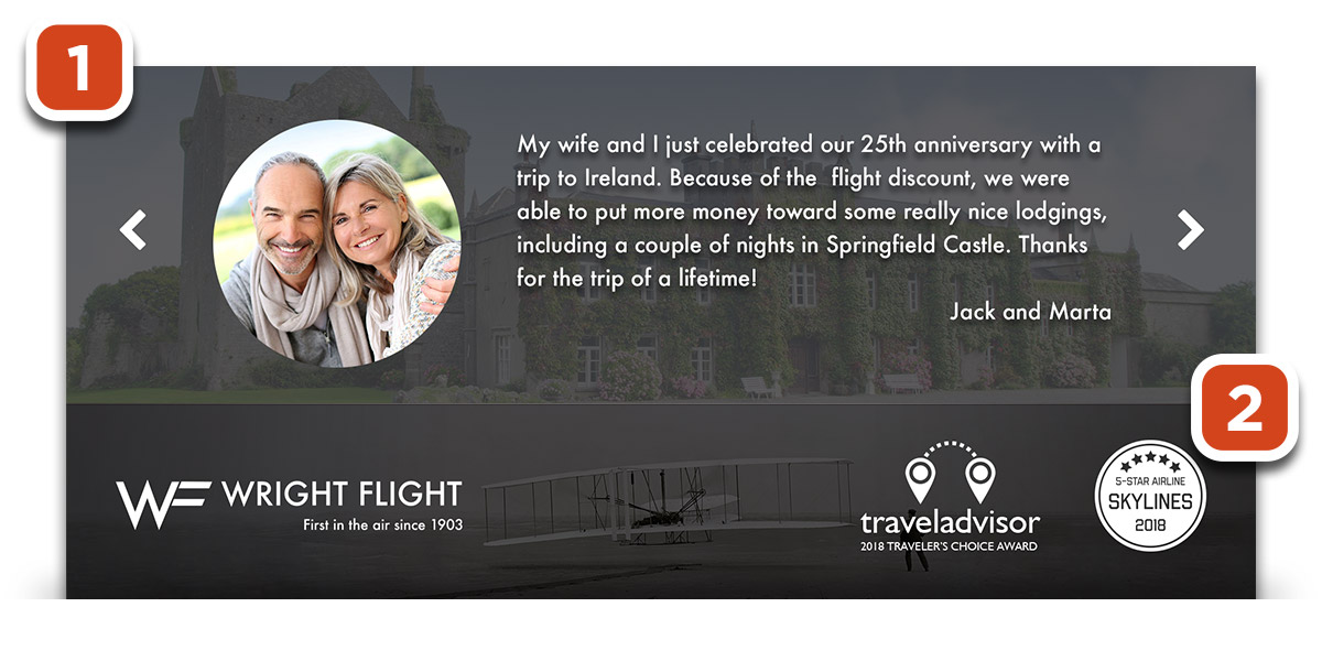
We naturally distrust advertising. One way to help our campaigns rise above that incredulity is by including some “social proof” on our page. What’s social proof? It’s basically just letting other people speak for us.
The classic example is a celebrity endorsement, but it’s also the weakest example. Why should anyone care what an actor—a professional pretender—thinks about a product? But we digress.
More effective examples of social proof are expert endorsements, customer reviews, and awards or certifications from recognized authorities or consumer advocacy groups. Grab ahold of these as you get them, and integrate them into your page. We’ve included two examples here.
- A customer testimonial slider in the middle of the page.
- A couple of awards Wright Flight has won in the footer.
Here are some additional types of social proof and confidence-builders to consider:
- Customer Lists — If your customers are better-known than you, then name-drop leverage their reputation, assuming you’re at liberty to do so.
- Case Studies — There’s probably no better way to prove yourself than to demonstrate the work you’ve done for others. The caveat here is that your landing page should only include a case study if it’s tied directly to what the page is about. Otherwise, leave it out.
- Social Media Mentions — If someone’s posted nice things about your offer, consider sharing the post and thanking them for the mention.
- Privacy, Security, or Return Policies — Providing clear policies on these sorts of sensitive issues will help build trust.
Loud-and-Clear Boarding Calls
The entire page culminates in your call to action (CTA)—the thing you’re asking people to do. In this respect, your landing page is a lot like a terminal or gate. The only reason to get people in there is to get them out to the aircraft.

For that, you need a loud-and-clear CTA. On this page, we’ve not only included it, but repeated it. Any of the CTA buttons will take a person to the bottom section of the page where they can search for a flight. Having the CTA in multiple places makes it unmistakable and always within reach.
Our checklist wouldn’t be complete without one more item:
Trusty Co-Pilot
If you’re not comfortable going solo, we’d be glad to take the yoke and make your pages fly.